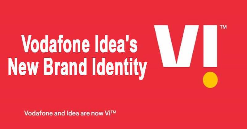
The rebranding of Vodafone Idea Vi -- using just the initials of the two companies, may have come two years after the merger of the telecom companies but reflects the spirit of integration, according to the company. A statement from Vodafone Idea Ltd said that Vi (read as We) is more than just an abbreviation of Vodafone and Idea. It is shorter, simpler and while referencing the origin of the two brands also reflects the collective nature of Indian society. It is not just about me, its especially about we," it added.
The branding was long overdue. Vodafone was an urbane, upmarket brand. Idea was a more rustic, lower-middle one. Their coming together necessitated a new avatar. In fact, it should have come much earlier," said Sandeep Goyal, chairman, Mogae Media, a Mumbai-based marketing and communication agency. Harish Bijoor, a brand strategy specialist and founder of Harish Bijoor Consults Inc said the timing for the announcement was right. Since bandwidth is in demand, it might make sense to unleash a new level and degree of service. This rebranding is all about corporate compulsions for sure. The brands have merged. VodafoneIdea is not Vodafone. Neither is it Idea. This is a new brand animal. Might as well brand it uniquely," Bijoor added. Speaking briefly at the virtual launch of the new brand, Piyush Pandey, global creative officer at the Ogilvy group, said that the brand reflects the spirit of integration and will further endear it with users across the country. Ogilvy, the agency which has been working with Vodafone for many years even when it was known as Hutch (the pug campaign) or later Vodafone (the zoo zoos commercials), has executed the rebranding exercise. The agencys chief creative officer Kiran Antony, who heads the Vodafone business, worked closely on the new identity. Vi is a new design system, not just an identity, the company said in a statement on Monday. The I is always punctuated with a bold mustard dot. It is confident, surprising, and delightful. It reflects the throbbing and progressive pulse of India. It is unique, continuously unpacking amazing possibilities, and always putting customers at the heart of everything," it added.
However, in a tweet, Bijoor said that he liked the way the brand sounds rather than it looks" referring to the new logo where the i in Vi is inverted. I am not a person who gets excited by logos from day one. Logos are visual cues that take time to settle. This one at hand is a forced one, which seems to want to keep both the 'v' of Vodafone and the 'i' of idea forcefully together to create an all-new meaning of a 'Vi' or a "we" as pronounced. To that extent, on the count of alphabet gymnastics, the brand Vi works," he said.

