
Rio de Janeiro / Washington D.C. | There are diplomatic embarrassments. And then there are moments that become symbols. The United States State Department's presentation at the AIDS 2026 International Conference in Rio de Janeiro on Sunday, July 26, is likely to become the latter, a moment so specific in its absurdity, so freighted with the context in which it occurred, and so widely photographed and shared by the high-level African officials sitting in the audience who watched it happen, that no apology from Foggy Bottom is likely to dislodge it from the cultural memory of American global health diplomacy.
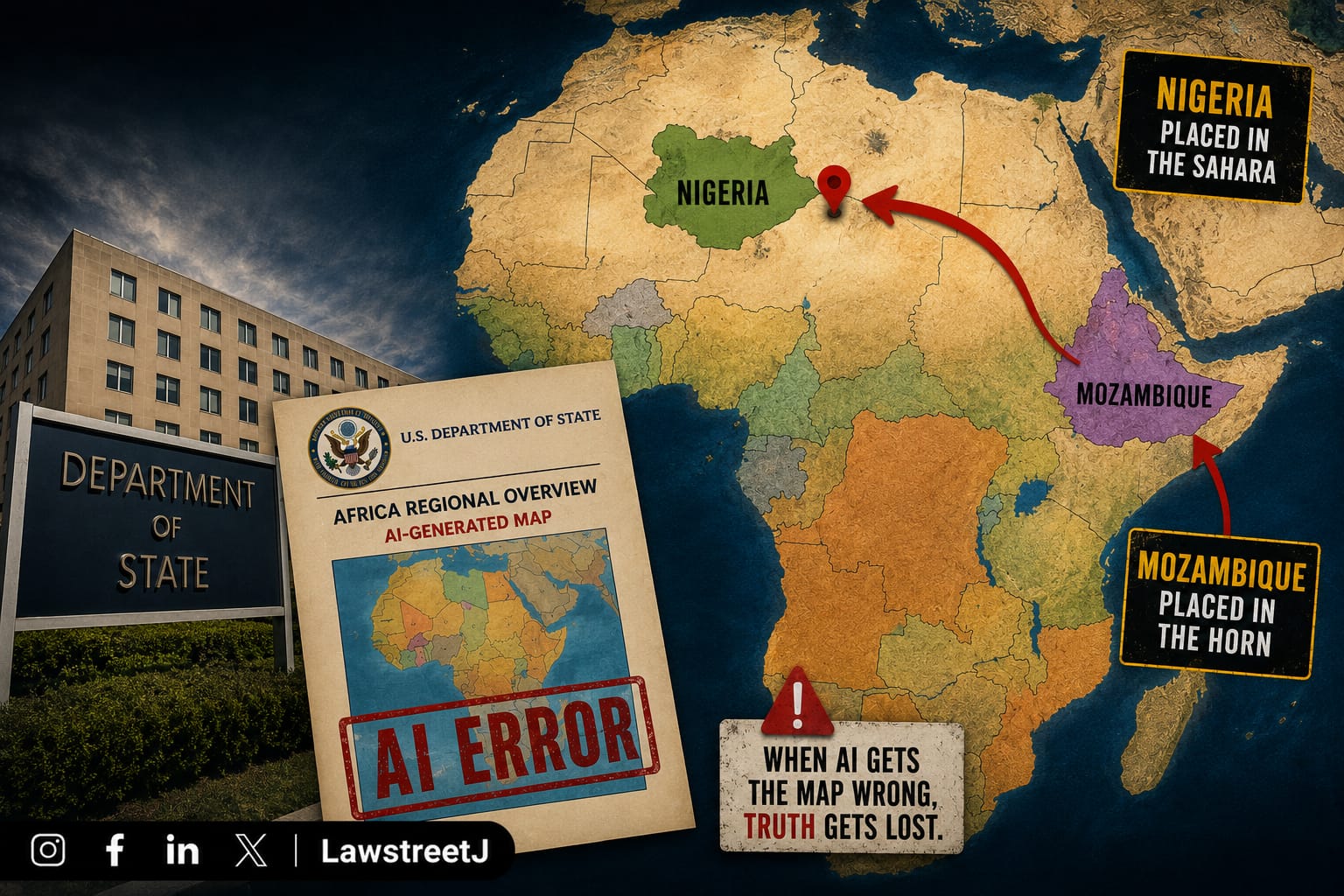
The map was shown during an event at the AIDS 2026 conference in Rio de Janeiro. It highlighted six countries on the continent: Nigeria, Mozambique, Uganda, Cote d'Ivoire, Malawi, and Cameroon. Not one of them was correctly identified by lines pointing from the names to the positions on the map.
Nigeria drifted into the Sahara Desert, landlocked and lost; Mozambique was relocated to the eastern Horn of Africa; and the Ivory Coast, somehow, found itself nowhere near a coast. Uganda and Malawi were placed in roughly the right region of the continent but with entirely wrong borders. Cameroon, dutifully included in the list of countries, got no real estate on the map at all, no line connecting the name to a country. And there was also a country on the map with no name.
The map was not a cartographic curiosity displayed in a hallway. It was the centrepiece of a formal State Department presentation, in front of an audience that included senior government officials from the very countries being mislabelled about American financial commitments to HIV/AIDS programmes across Africa.
What Was Being Presented, and Why the Context Makes It Worse
The session at which the map appeared was titled "Transforming health assistance: Implementing U.S. government MOUs for sustainable HIV programs", a pre-conference event at the International AIDS Conference, the largest and most attended HIV/AIDS policy gathering in the world. The speaker was Jeff Graham, the top U.S. health envoy who oversees the President's Emergency Plan for AIDS Relief, or PEPFAR. He did not reply to requests for comment.
PEPFAR is one of the most consequential and genuinely celebrated American foreign policy achievements of the 21st century. Launched by President George W. Bush in 2003, the programme has provided antiretroviral treatment, prevention programmes, and healthcare infrastructure support to tens of millions of people in sub-Saharan Africa and has been credited by public health researchers with saving over 25 million lives. It is, by most independent assessments, the single most effective American global health initiative ever undertaken.
It is also a programme that has been under severe strain since January 2025, when the Trump administration paused PEPFAR funding pending a review, disrupting aid programmes worldwide. PEPFAR's core work, such as providing lifesaving drugs, has largely resumed but the review period created a period of uncertainty that resulted in supply chain disruptions, clinic closures, and anxiety across the African health systems that depend on the programme's continuity.
The conference itself was interrupted by protesters angry over Trump's huge cuts to the HIV/AIDS initiatives around the world. High-level officials from Nigeria, Mozambique, Uganda, Côte d'Ivoire, Malawi, and Cameroon governments whose nations depend on PEPFAR funding were present in the audience. They took out their phones. They photographed the screen. They posted the images online.
The AI Watermark: How the Map Was Made
An analyst found the image of the map included in the presentation contained an artificial intelligence watermark that signals it was made with OpenAI tools. The company said it was investigating the report.
The State Department said it took "full responsibility" for the confusion caused and that the map had been produced by a team member who hastily changed the slide deck before the event.
The phrase "hastily changed the slide deck" is the State Department's explanation for how an AI-generated map, one that a cursory visual inspection would reveal to be catastrophically wrong, ended up in an official presentation before the world's largest HIV/AIDS conference.
The explanation raises more questions than it answers. Government presentations of this kind go through multiple layers of review before they are displayed publicly. The audience for this particular presentation included senior officials from the governments being depicted. The subject matter, PEPFAR funding commitments is among the most politically sensitive in American global health policy, at a conference where the administration is already under sustained protest pressure. That a map generated by an AI tool, one that produces outputs which cannot be used without verification, made it through whatever review process existed and onto the screen is a failure of process that the State Department's "full responsibility" statement has not yet explained in any meaningful way.
OpenAI's investigation into how its tools were used to generate the map and how the AI watermark ended up in the presentation is ongoing. The company has not yet commented on whether the image was generated through a licensed enterprise account, a consumer account, or through some other means.
Every Error, Documented
The specific geographic errors in the map, as documented by Reuters, CNN, and independent analysts, are worth cataloguing in full because they illustrate the extent of the failure.
Nigeria, Africa's most populous country, with 220 million people, and the country with the largest PEPFAR investment on the slide ($200 million) was shown as landlocked, positioned somewhere in the vicinity of the Sahel. Nigeria sits on the Gulf of Guinea on the West African coast and shares no border with any landlocked territory.
Mozambique, a southeastern African country on the Indian Ocean coast, and the second-largest PEPFAR recipient on the slide at $180 million was shown in the Horn of Africa, placing it approximately 3,000 kilometres from its actual location.
Côte d'Ivoire, a coastal West African country whose very name means "Ivory Coast" in French, a reference to its Atlantic Ocean coastline was positioned away from any coast in the map's rendering.
Uganda and Malawi were placed roughly in east-central Africa, the correct general region but with borders that did not correspond to their actual territorial extent.
Cameroon, which received $5.4 million on the slide, had no geographic marker on the map at all. Its name appeared in the funding list but was not connected by a line to any territory.
There was additionally an unnamed territory on the map that had a geographic marker but no corresponding country name, suggesting the AI tool had generated a generic African map placeholder rather than a verified geographic representation.
The Diplomatic and Policy Consequences
The immediate diplomatic consequence was played out in real time in the conference room. Senior officials from six African nations watched their countries disappear, relocate, or become unrecognisable on a map displayed by the United States government, at a conference specifically about American health investment in those countries. The State Department has been issuing apologies since the images went viral on Monday.
The broader consequence is more difficult to quantify but no less real. The Trump administration has spent the past eighteen months trying to reconstruct American credibility in sub-Saharan Africa following the USAID dismantlement, the PEPFAR funding pause, and the widespread disruption those decisions caused to health programmes serving populations with no alternative safety net. The Rio map does not create a new policy failure, but it provides a visual shorthand for a set of concerns that African governments, civil society organisations, and public health advocates have been articulating for over a year: that the United States' institutional knowledge of and attention to African realities has degraded in ways that have consequences for the people depending on American global health commitments.
The State Department said the discussions at the conference were "substantive and constructive" despite the map and that it remains committed to fighting AIDS with real results.
That statement is probably accurate. The policy discussions at AIDS 2026 were substantive, and PEPFAR continues to function and save lives. None of that is altered by a wrong map.
But the map is what went viral. And in a conference room full of officials from countries that have spent the last year watching American global health commitments wobble, a map that cannot locate Nigeria is not merely an administrative error. It is a symbol, one that African governments, opposition politicians, and public health advocates will be referencing in conversations about American reliability for considerably longer than the State Department's apology will remain in the news.


.jpeg)